
15 An example of integration with JavaScript - Reference Documentation
Authors: Andrea Del Bene, Carsten Hufe, Christian Kroemer, Daniel Bartl
Version: 1.0.0.BUILD-SNAPSHOT
15 An example of integration with JavaScript
It's time to put into practice what we have learnt so far in this guide. To do this we will build a custom date component consisting of a text field to edit a date value and a fancy calendar icon to open a JavaScript datepicker. This chapter will also illustrate an example of integration of Wicket with a JavaScript library like JQuery and its child project JQuery UI .15.1 What we want to do...
For end-users a datepicker is one of the most appreciated widget. It allows to simply edit a date value with the help of a user-friendly pop-up calendar. That's why nearly all UI frameworks provide a version of this widget.Popular JavaScript libraries like YUI and JQuery come with a ready-to-use datepicker to enrich the user experience of our web applications. Wicket already provides a component which integrates a text field with a calendar widget from YUI library, but there is no built-in component that uses a datepicker based on JQuery library.As both JQuery and its child project JQueryUI have gained a huge popularity in the last years, it's quite interesting to see how to integrate them in Wicket building a custom component. In this chapter we will create a custom datepicker based on the corresponding widget from JQueryUI project: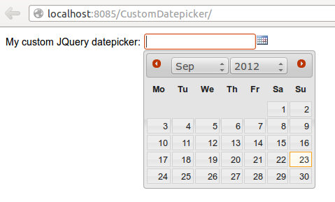
On Internet you can find different libraries that already offer a strong integration between Wicket and JQuery. The goal of this chapter is to see how to integrate Wicket with a JavaScript framework building a simple homemade datepicker which is not intended to provide every feature of the original JavaScript widget.
What features we want to implement
Before starting to write code, we must clearly define what features we want to implement for our component. The new component should:- Be self-contained: we must be able to distribute it and use it in other projects without requiring any kind of additional configuration.
- Have a customizable date format: developer must be able to decide the date format used to display date value and to parse user input.
- Be localizable: the pop-up calendar must be localizable in order to support different languages.
15.2 ...and how we will do it
Our new component will extend the a built-in text field org.apache.wicket.extensions .markup.html.form.DateTextField which already uses a java.util.Date as model object and already performs conversion and validation for input values. Since the component must be self-contained, we must ensure that the JavaScript libraries it relies on (JQuery and JQuery UI) will be always available.Starting from version 6.0 Wicket has adopted JQuery as backing JavaScript library so we can use the version bundled with Wicket for our custom datepicker.To make JQuery UI available we should instead go to its official site, download the required artifacts and use them as package resources of our component.Component package resources
JQuery UI needs the following static resources in order to work properly:- jquery-ui.min.js: the minified version of the library.
- jquery-ui.css: the CSS containing the style used by JQuery UI widgets.
- jquery-ui-i18n.min.js: the minified JavaScript containing the built-in support for localization.
- Folder 'images': the folder containing picture files used by JQuery UI widgets.
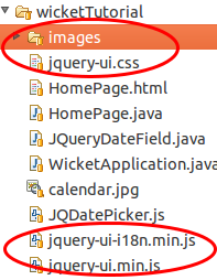 Along with the four static resources listed above, we can find also file calendar.jpg, which is the calendar icon used to open the pop up calendar, and file JQDatePicker.js which contains the following custom JavaScript code that binds our component to a JQuery UI datepicker:
function initJQDatepicker(inputId, countryIsoCode, dateFormat,  calendarIcon) {
	var localizedArray = $.datepicker.regional[countryIsoCode];
	localizedArray['buttonImage'] = calendarIcon;
	localizedArray['dateFormat'] = dateFormat;
	initCalendar(localizedArray);
	$("#" + inputId).datepicker(localizedArray);
};function initCalendar(localizedArray){
	 localizedArray['changeMonth']= true;
	 localizedArray['changeYear']= true;
	 localizedArray['showOn'] = 'button';
	 localizedArray['buttonImageOnly'] = true;
};- inputId: the id of the HTML text field corresponding to our custom component instance.
- countryIsoCode: a two-letter low-case ISO language code. It can contain also the two-letter upper-case ISO country code separated with a minus sign (for example en-GB)
- dateFormat: the date format to use for parsing and displaying date values.
- calendarIcon: the relative URL of the icon used as calendar icon.
Initialization code
The initialization code for our component is contained inside its method onInitialize and is the following:@Override protected void onInitialize() { super.onInitialize(); setOutputMarkupId(true); datePattern = new ResourceModel("jqueryDateField.shortDatePattern", "mm/dd/yy") .getObject(); countryIsoCode = new ResourceModel("jqueryDateField.countryIsoCode", "en-GB") .getObject(); PackageResourceReference resourceReference = new PackageResourceReference(getClass(), "calendar.jpg"); urlForIcon = urlFor(resourceReference, new PageParameters()); dateConverter = new PatternDateConverter(datePattern, false); }@Override public <Date> IConverter<Date> getConverter(Class<Date> type) { return (IConverter<Date>) dateConverter; }
Header contributor code
The rest of the code of our custom component is inside method renderHeader, which is responsible for adding to page header the bundled JQuery library, the three files from JQuery UI distribution, the custom file JQDatePicker.js and the invocation of function initJQDatepicker:@Override public void renderHead(IHeaderResponse response) { super.renderHead(response); //if component is disabled we don't have to load the JQueryUI datepicker if(!isEnabledInHierarchy()) return; //add bundled JQuery IJavaScriptLibrarySettings javaScriptSettings = getApplication().getJavaScriptLibrarySettings(); response.render(JavaScriptHeaderItem. forReference(javaScriptSettings.getJQueryReference())); //add package resources response.render(JavaScriptHeaderItem. forReference(new PackageResourceReference(getClass(), "jquery-ui.min.js"))); response.render(JavaScriptHeaderItem. forReference(new PackageResourceReference(getClass(), "jquery-ui-i18n.min.js"))); response.render(CssHeaderItem. forReference(new PackageResourceReference(getClass(), "jquery-ui.css"))); //add custom file JQDatePicker.js. Reference JQDatePickerRef is a static field response.render(JavaScriptHeaderItem.forReference(JQDatePickerRef)); //add the init script for datepicker String jqueryDateFormat = datePattern.replace("yyyy", "yy").toLowerCase(); String initScript = ";initJQDatepicker('" + getMarkupId() + "', '" + countryIsoCode + "', '" + jqueryDateFormat + "', " + "'" + urlForIcon +"');"; response.render(OnLoadHeaderItem.forScript(initScript)); }
If we add more than one instance of our custom component to a single page, static resources are rendered to the header section just once. Wicket automatically checks if a static resource is already referenced by a page and if so, it will not render it again.This does not apply to the init script which is dynamically generated and is rendered for every instance of the component.
Our datepicker is not ready yet to be used with AJAX. In chapter 16 we will see how to modify it to make it AJAX-compatible.